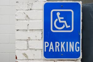
We’ve all seen the universally-used disability symbol, whether it was at the mall, at a school or posted on the side of the big bathroom stall that every able-bodied person wants to use. This blue square with a white image of a person sitting in a wheelchair is a symbol that’s recognized worldwide. This symbol is an indication that the marked area is designated for individuals who have a disability.
The Accessible Icon Project is updating this bland symbol, and creating new ones that are engaging and exciting.
Triangle, a non-profit organization dedicated to helping individuals with disabilities move forward, has teamed up with the Accessible Icon Project. Together, they work to transform the handicapped symbol into a symbol of empowerment. The Accessible Icon Project strongly believes in appropriate visual representation for people with disabilities.
The Accessible Icon Project has put all their efforts into making sure people with disabilities are represented in the way they want to be recognized, and in a way that portrays their abilities, accessibility and potential.
Although the standard wheelchair icon has been used for a long time, its posture and immobile look give the impression that people with disabilities have very-little movement and even less independence. It also portrays the concept that only wheelchair users are considered disabled, which is not the case. This company wants the universal symbol to represent more than that.
Instead, The Accessible Icon Project aims to have people view this symbol as portraying movement, action, and accessibility -- rather than limitations.
To help portray this, The Accessible Icon Project made a few adjustments. First, they adjusted the head of the icon forward to suggest movement. Next, they moved the arms up, to indicate navigation. Lastly, the legs were moved forward, and a notch was taken out of the wheel to make it look as though it was moving.
The Accessible Icon Project describes the new handicapped symbol as active, abled and ready for action. The important thing they want individuals to know is that these symbols represent the idea that people with disabilities are active and engaged.
The efforts to replace the old symbol with the new one has been successful, and is continuing to expand. The Accessible Icon Project hopes to raise awareness with this new icon, and to change the way people think about individuals with disabilities. The goal is to get people to take notice of what others can do, rather than focus on what they can’t do.
The possibilities are endless with The Accessible Icon Project. Their passion and efforts towards making this world a better place are inspiring. Even more importantly, their vision is helping to give back to the community, providing a voice for people with disabilities, and portraying the symbol for disability as a symbol of empowerment.
For more information, visit their website at www.accessibleicon.org.
Great to see some "forward" thinking and action!